Pink: meaning, combinations and trends
Femininity, delicacy and, why not, power?
In today’s article, we’ll talk about the meaning of the color pink, which is undoubtedly the color of the moment.
As a feature in WGSN + Coloro forecasts, Orchid Flower was elected bet for 2022 and 2023 and also dominated the collections and catwalks of the big brands, in addition to social networks.
With Pink PP, by Valentino, and the barbiecore style, the color pink shows how strong and versatile it is and that it goes far beyond a romantic tone, which it is often associated with.
And, of course, if you, like me, want to explore this trend and use more pink in your routine, I will also bring combinations with different shades of pink, already separated by Personal Coloring seasons!
The meaning behind the color pink
First of all, you need to know that each color carries with it an universal meaning, cultural message, as well as contemporary relevance. We can also associate with psychology and the affective memory of each one.
There are some points that we need to analyze when talking about a specific color. Especially because, over time, the colors and tones gain new meanings as the history itself is built.
As I said before, the object of study of this article is the color pink!
In the pink family, it is important to keep in mind that there are infinite shades. We can have lighter or darker pink, hot or cold, intense or soft.
So, If we change the shade of pink, its meaning will certainly change too.
In general, we associate pink with femininity, fragility, sweetness and delicacy, especially in its lighter tones. On the other hand, bright pink means passion, boldness and sensuality.
However, with fashion trends and the spirit of the times, we realize that color also acquires other messages.
Pink as a trend
You might be wondering: should I follow a trend such as a specific color like pink? I can certainly answer you: it’s your decision!
As we are used to, trends are fleeting. Before opting for a pink piece, reflect not only on its harmony with your beauty, but how far it connects with your desire for image and personal style.
Let’s talk about some of these trends?
Orchid Flower: WGSN + Coloro’s bet for color of 2022
As I already mentioned here on the blog, still in 2020, the Worth Global Style Network (WGSN), which works with trend forecasting, and Coloro elected Orchid Flower as the tone of the year for Spring 22/23.
“Orchid Flower has an intense, hyper-real and energizing quality that will stand out in both real-life and digital settings. It is also versatile enough to work across seasons and continents. In a challenging time, this saturated magenta tone will be a great way to create a sense of positivity and escapism.,” says Coloro’s Head of Content, Joanne Thomas.
We already knew, then, that pink would come very strongly into fashion… And, in fact, what we had was an explosion of the tone in its most diverse shades, being able to be used for different styles and color palettes.
Pink PP: a cold and intense pink!
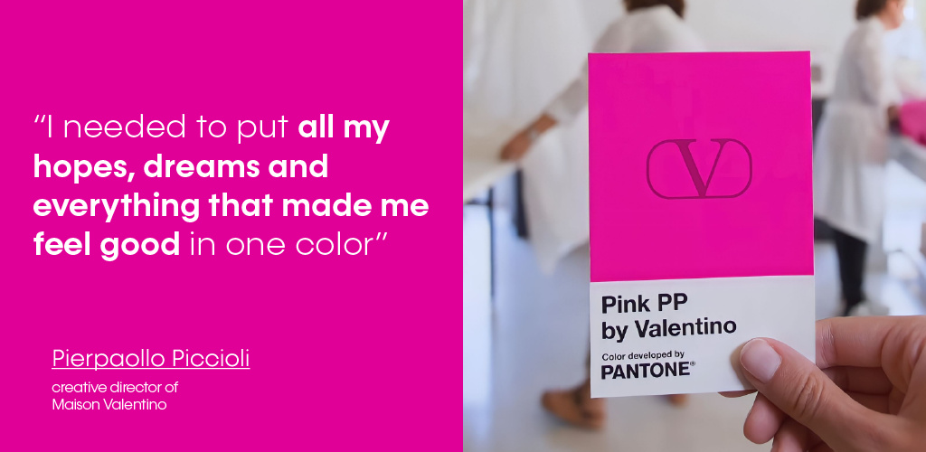
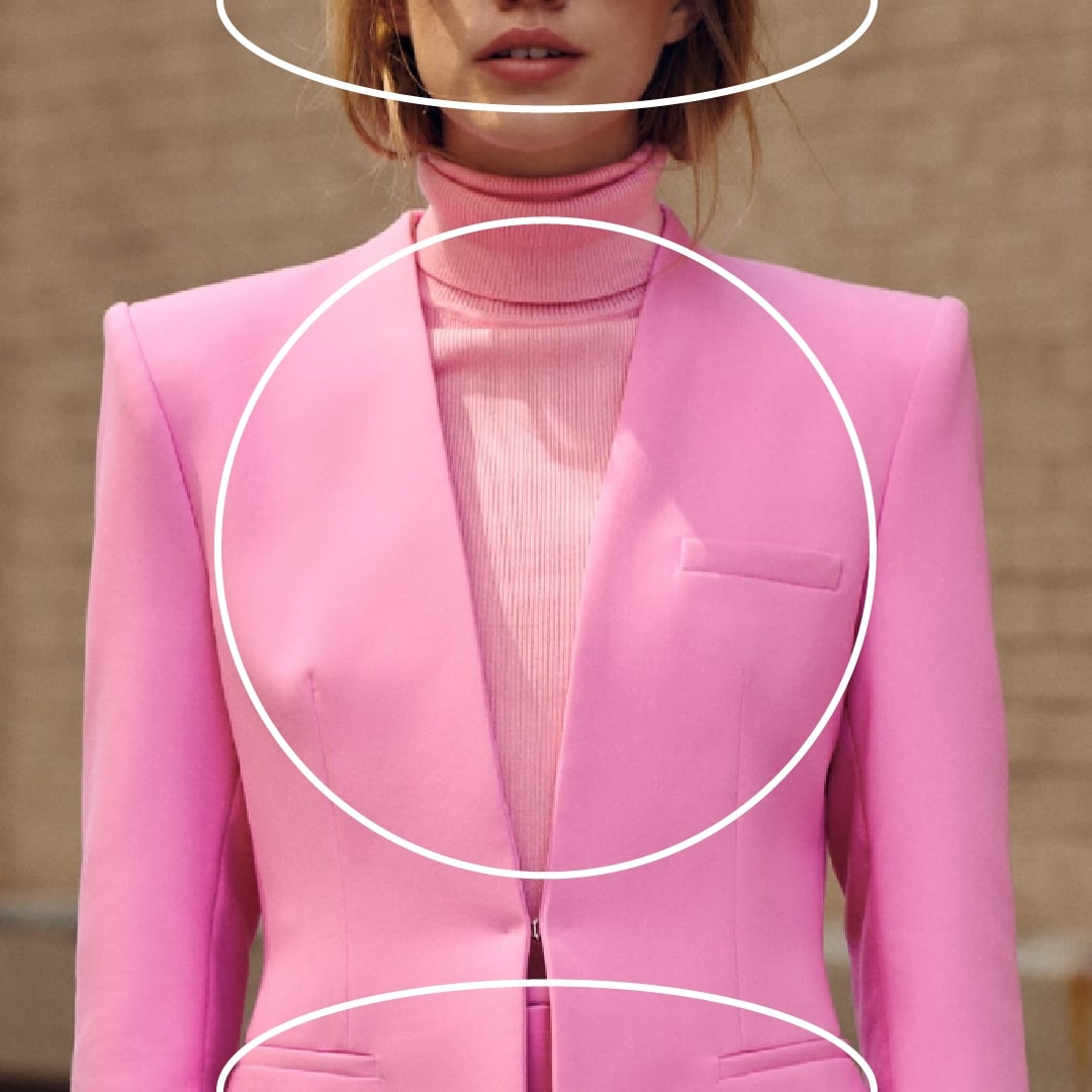
In the Valentino Fall/Winter 22-23 collection, designer Pierpaolo Piccioli has done more with less by choosing a single shade as the protagonist of the entire collection, Pink PP!
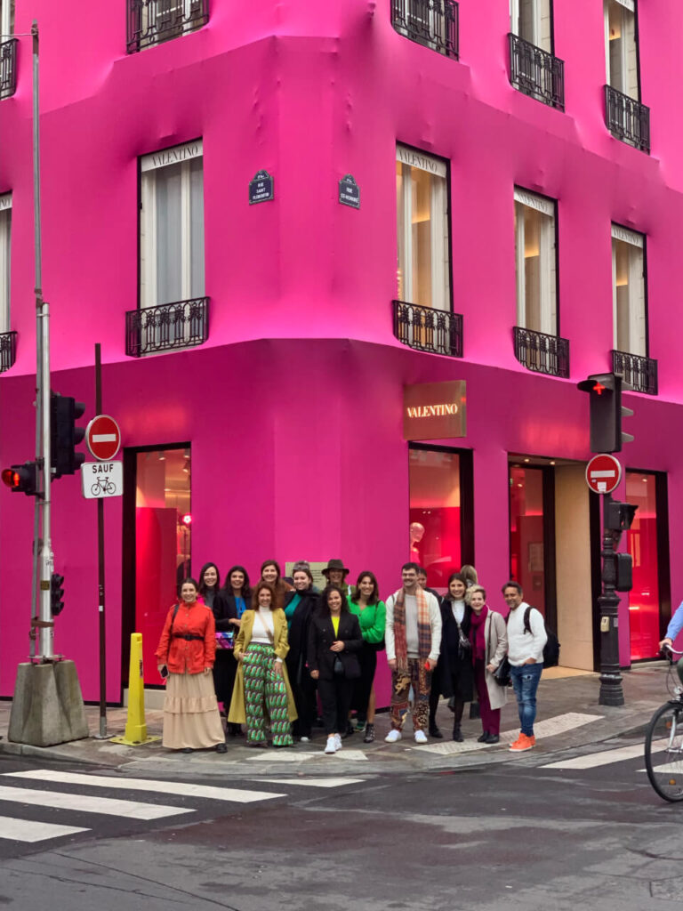
Our 1st class from Colors in Paris at Maison Valentino.
We can classify Pink PP, by Valentino, as a cold pink tone, so it has more bluish pigment in its composition. It’s also an intense color with a lot of vibrancy, and has an intermediate depth.
It’s the perfect pink for winter palettes.
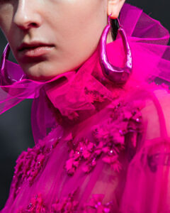
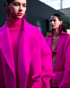
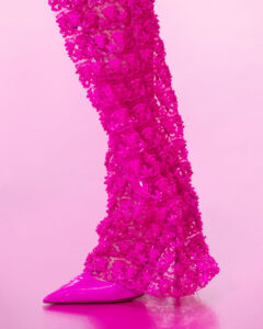
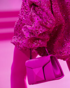
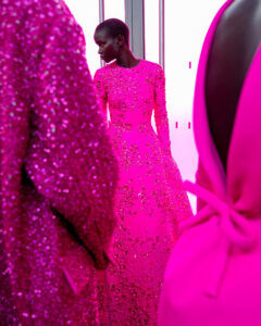
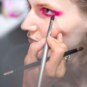
But of course, if you’re not Bright Winter, Dark Winter or Cold Winter, you can also use this color.
All you have to do is use the right compensation strategies, such as make-up in the tone of your palette, showing your cleavage, and wearing accessories close to your face in your colors.
But back to Pink PP…
According to Valentino, on its official website, Pink PP conveys individuality, freedom and curiosity. And also a message of equality, love and inclusiveness. It is a very energetic tone with a lot of vibration
Zara in Paris, now in September of 2022, had entire racks dedicated to color.
Barbiecore style
With the progress of the filming of the Barbie movie, starring Margot Robbie and Ryan Gosling, pink has reaffirmed itself in the streets, social networks and catwalks of the planet!
In its choking and bubblegum versions, we saw several celebrities wearing pink from head to toe. We name this style as “barbiecore”.
The barbiecore style explores monochrome looks in shades of pink. The fun here is to use color in favor of your personal style. So, make it look like you!
Curiosity: the history of the rose
In nature, did you know that pink pigment is very difficult to find? We can only see it in quartz!
It was also a color that took a long time to be applied to fabrics, which only happened around the 18th century. It was used by both men and women.
Meanings of shades of pink by season
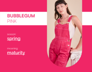
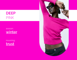
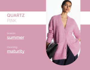
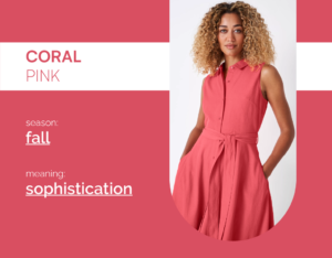
I had to bring here the meaning of different shades of pink, classified according to each of the four seasons of Personal Coloring.
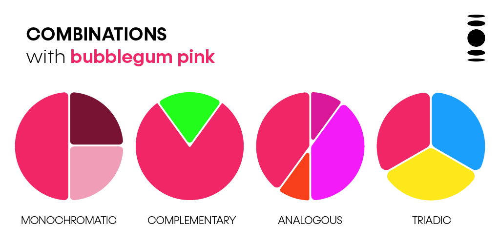
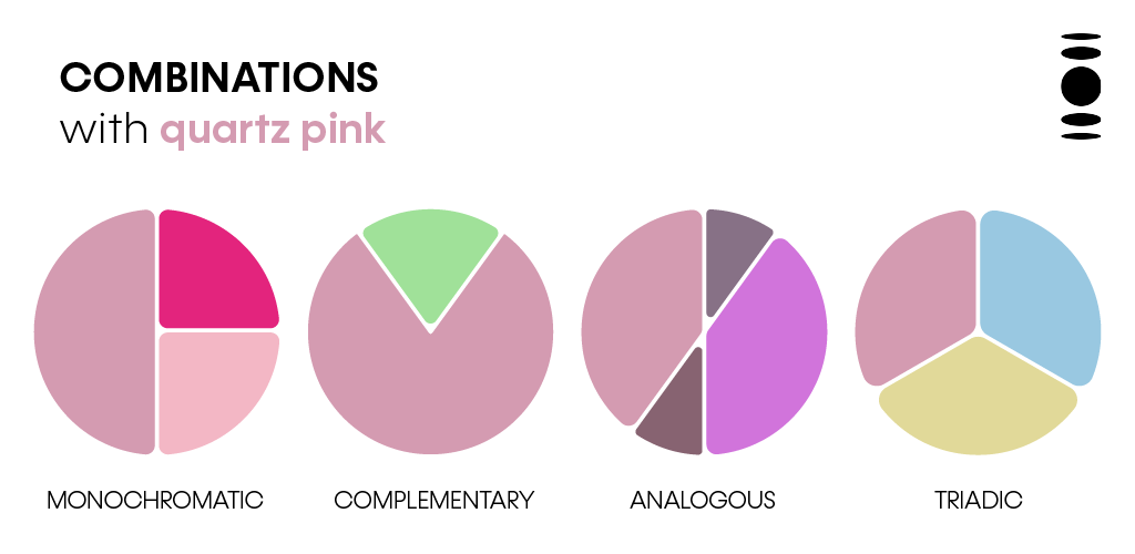
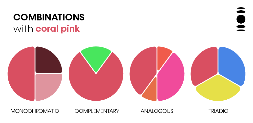
In spring, we have Bubblegum Pink as an example. In summer, Pink Quartz. In Fall, Coral Pink. In winter, Deep Pink.
How to combine pink: the guide not to go wrong!
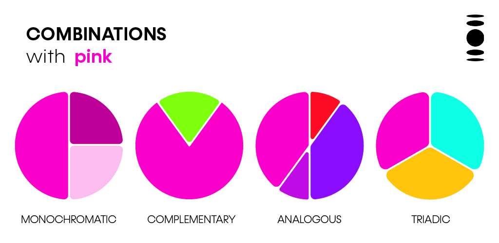
Do you need inspirations on how to match pink safely and without fear? See what I prepared for you:
Want to know more about Colors and Personal Coloring?
Do you love working with people, beauty and self-esteem?
I wait for you on my next Personal Coloring Training classes!
There are more than 60 hours of content, in which you learn from the theory of the Color Dimension, Expanded Seasonal Method, History of Personal Coloring, to the practical part of the test script, service and pricing.
A complete course, with support at each stage and practical class for you to train your eyes in Color Consulting. I’m waiting for you!




Add comment